Mercantile 37
BRAND DESIGN + ASSETS | 2017
FOUNDRY & CO.
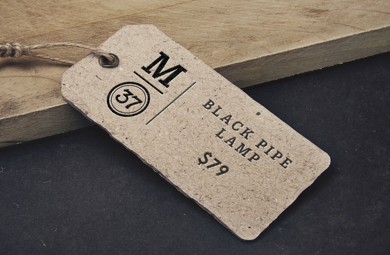
A place for artisans and antiquers; this showroom and cafe sit in a rejuvenated storefront that is filled with historical warmth. Woodblock type and hand-painted lettering informed this mark.

Handmade, homegrown
Rebuilt and led by a family of craftsman, cooks, and creators, this store is frequented by many in the community. The logo and encompassing brand needed to echo the crackled patena of an antique while being incredibly versatile for a growing brand.
After sampling hundreds of hand-lettered, woodcut, and fading type, we created this 3 and 7 to fit perfectly together. A sturdy slab serif accompanies it, making for a balanced logo arrangement and plenty of charm to bolster the history it holds.
Image by Mercantile 37
Image by Mercantile 37
Community is Built by History
TAKEAWAYS:
A lot of my earlier work was shadowed by my high opinion of myself and the standards of design I saw fit to impose on some clients. Mercantile 37 was such a great example of what could happen if I loosened my grip and collaborated with the client more. Magic. A happy client and a lesson learned.


