

City of Marion
BRAND DESIGN | 2015
MARION DESIGN CO.
The city of Marion is rooted in a deep sense of story. They command local pride by sharing stories of championed triumphs and successes, heart warming and painful alike.
Telling the story of the past is one thing and fostering the story of tomorrow is another. By developing a new identity rooted in the people of Marion, the result rejuvenated an amazing community with a renewed sense of pride, hope, and energy to move forward.


Thrive, home, future, and hope were few of many important words we heard from the community.
When look at all the potential type treatments we knew from the start that the new Marion wordmark had to be clean and sharp, while remaining soft, rooted, foundational, and memorable.
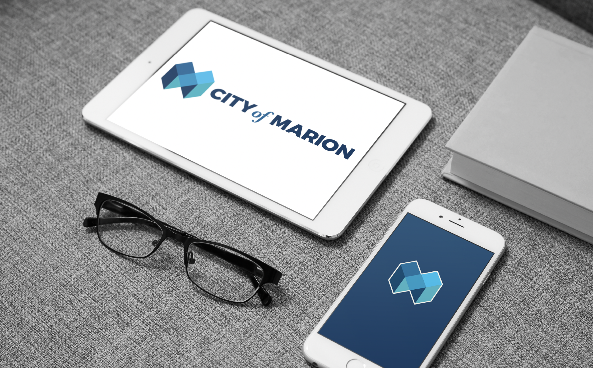
The anatomy of the logomark shows the grid structure of the city of Marion, overlapping systems of streets and buildings.


City of Champions
TAKEAWAYS:
Taking time to listen, break bread, and brainstorm with community members was infinitely valuable to our final designs and city buy-in. The most important part of designing for deep memories and lots of people is to just hear everyone out.